I moved to a new blog awhile back. I post to Geospatial Technologies in Education. All the posts from this blog have been ported over there. Follow over there because I don't use this site anymore. I keep this blog alive because I like all the sidebar links, most of which may be broken. Sorry about that part.
Friday, November 18, 2011


Tuesday, April 27, 2010
Moving this GIS Blog to a New Geospatial Blog
 As of January 1, I am no longer at Vassar College. I started the GIS at Vassar blog for myself, so that I could do my job better, to keep track of links to useful web sites, to remember Google Earth KML network links useful for teaching, to answer questions that faculty and students had around the college, and to remember projects that I found valuable. Over the three and a half years of running this blog (I started it in September 2006), I've had an average of about 50 page views a day. And though I really slowed down on my posting while I've been doing my Fulbright, I still get visitors. So the GIS at Vassar blog and the old posts will stay right where it is, but I will no longer add new posts to it. I will start more posting to a new blog called Geospatial Technologies in Education that I set up on Posterous. I migrated the old posts there but will keep adding new material. Please follow me there.
And if you're in the market for an educational and geospatial technology professional with skills in ArcGIS, Google Earth, field technologies like tablet PCs and GPS receivers, and spatial literacy, I'm available... stewart (dot) meg (at) gmail (dot) com
Wednesday, April 14, 2010
Final Map For Grenadines MarSIS Project: Some of the Details
 I have finished up my Google Earth project for the Grenadines. If I didn't have grant proposals, papers, job searches and interviews, and other mundane tasks like that, I would have completed this project in about six weeks. That's the way it goes sometimes.
Here is the link to the Grenadines MarSIS geodata KMZ for your viewing pleasure. The link will launch Google Earth.
I also created (thanks to Valery Hronusov) a KMZ of a nautical chart for the Grenadines. Check it out. It’s big, about 10MB.
And check out the video that describes what’s in the file and explains how to make sense of the many layers of data.
After the first draft of this KMZ, I ran a post that gave a little how-did-I-do-it synopsis. Now I will discuss what the final issues were and how I resolved them.
The original database I was handed was compiled as an ESRI geodatabase. I'll admit it, I have been slow to the geodatabase lifestyle. When I exported shapefiles in my first draft, I had lots of '1's and '2's that looked like this: Island= 1. What I needed to do was export feature classes to a shapefile. I had to switch all the ‘1’s to equal the proper designation that the researcher applied back when the database was built. So now the file shows Island = Mayreau. It was a bear, I must say. But it made it so that the KMZ placemarks contained the information that the original layer contained. It had to be done.
I had to use an HTML editor. I don’t think I mentioned this in my other post, but it is required. That little HTML class I took back in 1996 at the community college still comes in handy. I used HTML-Kit. It is free and works like a charm.
The MarSIS logo used to not stay static. It would stretch and squish when the Google Earth window was resized. I used this helpful site that gave me the code to help me created the screen overlay for the MarSIS logo. This interactive KML code site is superb as it gives you the code to work up in your HTML editor. I got the snippets, those extra lines of text under the folder or placemark (circled above), to go away. That was done with the HTML editor. Use this snippet code
 after the folder or placemark name tag. Find the snippet code discussion here.
I added a legend for the habitats, both shallow water and deep water, using Adobe Illustrator and then creating a screen overlay, see above, with that raster but this time hard-wired to the lower left-hand corner of the screen.
I mentioned in another post that I had fabulous success with SuperOverlay. It bears repeating. I had a large raster file map that I wanted to bring into the project. SuperOverlay was the way to go because it automated the process of slicing up the map to create a smaller KMZ. It was still 10MB so we did not include it with the project KMZ.
Lastly, I had about 200 photographs and 200 videos with geolocations by latitude and longitude to include in the KMZ. Google Spreadsheet Mapper 2.0 made geolocating photos a breeze. Video are a different story. The first draft of the project had a simple screen capture taken from each of the 200 videos that I used as a placeholder until I uploaded each of the videos to a place. That place was YouTube, naturally. The problem is, Spreadsheet Mapper does not take video embed codes, unfortunately. What I did was meticulously copied each video’s embed code as the video finished being uploaded, saved those codes to MS Excel (could have used Google Docs but didn’t), then modified the original previously geolocated placemarks with screen captures that I had created in Spreadsheet Mapper. I erased out the tag for the image and copied in the embed code for the video. It worked very well. All of this was NOT a big deal and I spend more time dreading doing it than I needed to. In retrospect, using the Spreadsheet Mapper to geolocate the video locations was very useful for quickly and accurately finding where the videos belonged in the world.
And now I am done and popping some sparkling wine. On to the next project...organizing the CERMES department's GIS data library. Cheers!
Mashup image above uses a Creative Commons photo from titanium22’s photostream.
Friday, April 09, 2010
Talk on Tablet PCs in Field Classes and Research
Thursday, March 18, 2010
Google Earth Tutorial for the Grenadines Project
The Grenadines MarSIS project web page now links out the the KMZ file that I've been working on. Find it here. You can also get the nautical chart. We made a video to help folks navigate the many layers of geo-data. I think it might help since there are a lot of layers to keep track of.
Wednesday, March 03, 2010
Using Superoverlay for Your Google Earth Project
 You know those times that you have a large scanned map of your field area or project site and you want to use Image Overlay to add the map to a Google Earth project? If you want the file size to remain small and portable, you need to re-sample the map and lose all your useful information, or you can try to keep the map as the original file size and then you have an enormous KML to share. What to do? Use Superoverlay!
Superoverlay, developed by Valery Haronusov, has been around as long as I've been dabbling in Google Earth, I just never gave it a try. Until now.
I've been working on a Google Earth project based in the Grenadines. One of the files that I needed to add to the project folder is a nautical chart (shown above) that in digital form is a 110 MB file. It would be too unwieldy - both geographically and in digital file size - to try and do an Image Overlay for this file so I needed to make it smaller and so used Superoverlay. Superoverlay cuts up the raster file into rectangular chunks and creates smaller raster tiles. This makes it so that when you zoom in, the tiles that draw are more clear and have the nice resolution that you want maintained. You can do this by hand. But why?
I followed the Superoverlay instructions, which are great. Because the chart was in UTM, I needed to re-project to the WGS84 coordinate system. Superoverlay uses the world file (i.e., *.jpx, or *.tfw) for spatial reference. The spatial reference is read directly from the world file. The output I got for the KMZ file of the nautical map was 10.5 MB.
There was one slight problem. The nautical chart looked great but I have other files in my project that need to draw over the chart, and the chart was not drawing on the bottom. This had something to do with the DrawOrder tag. I contacted Valery to see how this could be fixed and he found this ordering issue to be a bug and he fixed it! If you want your Superoverlay map to draw under your other files, use a negative number in the Start draw order box (circled in green above). I found that -20 gave me the order that I was looking for. By the way, it may seem like you can just reorder your KML files in the folder and place the Superoverlay map at the bottom and then this problem is fixed (like in ArcGIS). It doesn't work that way in Google Earth, unfortunately.
 Shown above is the mapping of the shallow marine habitat near Mayreau and Union islands with the nautical chart layered underneath. Just the way I wanted it.
If you're interested in GTOPO30 maps for the world (shown below), one has been created by Valery using Superoverlay. Click here to find it.
This is how to make the file shown above. So, if you have super huge raster datasets, what do you do? Use online storage. Here is some useful information from Valery on the process of these larger Superoverlay projects:
"I use Dropbox and Amazon S3 storage for tiles. For huge rasters I use Global Mapper + Superoverlay or KML2KML. Global Mapper makes large tiles (2048 x 2048) from huge and Superoverlay makes small tiles (256 x 256) from large. And with the last one, we can copy to cloud web storage (S3) an absolute "authoring" independent low cost solution. I use Cloudberry as an Amazon S3 explorer."Thanks, Valery! This is all great stuff and so helpful.
Friday, February 05, 2010
Weighing In: Like Everyone Else, I've Got Something to Say About the iPad
 The big news this past week was Steve Jobs' throwing the coverlet off of Apple's long-awaited iPad. Though it has long been rumored that Apple would make a tablet PC, none had materialized. The wait continues. Touted as a 'tablet PC,' the iPad is not that. The fever surrounding the launch of the yet-unnamed-Apple-tablet was incredible. Then once it hit the streets, everyone and her auntie had gushy words for it. On Twitter, #iPad was number one with a bullet all week, even in the face of people still buried under rubble in Haiti and the President giving his first State of the Union address. It's still a Trending Topic today. It's weird. Even my favorite political podcast at Slate, last week, couldn't resist weighing in on the iPad. Why? I really don't get all the fuss as yet. Another favorite podcast of mine, Digital Campus, seemed to think that the iPad would be awesome for archaeology or geology students because those students would have all this internet information at the their fingertips when they're out on their digs. What?! Field researchers need data collection tools (like a tablet PC) when they're out there in the muddy and the dusty and the boggy. Maybe I'm missing the point.
This line from Steve Jobs' announcement demo doesn't help give me any more clarity: "It’s phenomenal to hold the Internet in your hands." Umm, I'm using a netbook /Blackberry/iPhone /tablet PC right now and I'm actually holding the Internet in my hands. Weird.
Look, I want more choice in hand-held devices just as much as the next guy. But what the 1st Gen iPad seems to be is a large iTouch. Maybe before the 2nd Gen iPad comes out, Apple will listen to all the howling cries of ...So What!...*yawn*...Big Deal!...and actually add some functionality to the pretty little thing. Or it could just remain a Kindle alternative. That's fine with me, except for the fact that I don't really read books anymore. I listen to them on my iPOD!
Dear Apple, If you really want to make a killer tablet PC, make it so that I can do Adobe Photoshop and Illustrator using the tablet's pen, I don't want to use a Wacom tablet because I think your new iPad would deem them obsolete. While you're at it, give me some GPS location-based ability. Didn't you hear that everything these days is really GEO-everything? In an ideal world, I could actually make maps on an iPad using a GIS software and make drawings using something like AutoCAD, but I digress. But for goodness sake, I want to make phone calls, make videos, shoot photographs, record a podcast. Awesome price on these little 1.5 lb babies, by the way. Don't change that, alright? Alright.And all you fans and rushers-out-to-get-the-new-
So, for the Apple iPad, take my advice: wait. And as for the unfortunate name...look at 'Google'?
Tuesday, January 19, 2010
Google Earth Workshops Given in St. Vincent and the Grenadines
While traveling to St. Vincent, Grenada and Union Island this past November, I took some video of our workshops and the intervening travel between workshops. Kim Baldwin, PhD student at CERMES, and I were there to talk about her MarSIS marine mapping project and show how to view the geodata in Google Earth. I only just now was able to get to finishing up editing the video from our trip. I blogged about the workshops on my other blog, if you're more of a reader than a viewer of video.
Sunday, November 29, 2009
Geo-Geek Shirts & Stickers..For Gifts!
 I don't usually promote clothing in this space but this site, Geo-Tee, crossed my desk and I thought they have some cool GISy offerings just in time for the holidays. They've got T-shirts and stickers for the GIS-inclined. Here's what they've got to say about themselves:
We supply apparel for the seasoned old-school GIS’r that was doing GIS with punch cards, to the newbie who just figured out the difference between a datum and a projection.

Tuesday, November 24, 2009
Mapping Grenadines MarSIS with Google Earth
 I haven't written in awhile nor kept this blog updated on my project work. I've been busily working away at CERMES on a decent first draft of of the Grenadines MarSIS Google Earth file that I discussed previously on my other blog. Though I have a post that says I got the geodata back on September, I really got the final, final data about two weeks before a workshop trip, launching the file that I'm going to explain in this post.
I went with MarSIS project leader and GIS data collector, Kim Baldwin, on a presentation tour to three public workshops the week of Nov 9 to 13, 2009, and you can read about that trip here. It was amazing. She presented the GIS work she's done and I showed the participants how to use Google Earth and how to use the MarSIS data in Google Earth. The MarSIS project is a marine-based resources project for the Grenadine Islands, between (but not including) the islands of St. Vincent and Grenada in the Caribbean. That's all about the workshops for now.
As a result of the workshops, we got terrific feedback on the usability and functionality of the project KML. There were some things that were not so clear, too. We are not ready to show or give out the final version of the KML. Once the file is ready, it will be launched on the MarSIS web site as a Google Earth API plug-in and I'll blog about it. The plan for this user-ready final product is February 2010. Above, is a list of the subsets of data layers found in the MarSIS project. I basically took Kim's Geodatabase feature layers and exported them using the free ArcScript Export to KML or the not free Xtools Pro. There was some iteration involved but I used one for one thing and one for another. It was pretty painless.
The two screen captures below show some of the results of the export process. There's no legend which is something I will work on in the coming months. Above, shows the shallow water habitat polygons, locations of whelks, and sea turtle nesting beaches around and near Mayreau Island.
 And this screen capture above shows Space-Use Patterns (pink font) and Marine Resource Users (blue font) layers turned on for the area surrounding Union Island.
 Kim has a lot of underwater photographs that she's used to identify habitat type and map the sea floor. Above is an example of what one of the photos looks like in the KML. I also blogged about the preliminary results on another blog I have. She also took a lot of underwater video for the deeper areas for the same reason, to map the sea floor. The videos will be included, but for the recent presentations, we used a representative single frame as a jpeg. There are nearly 400 locations and images that are in the KML. Here is how to put lot's of photos into KML.
Use Spreadsheet Mapper 2.0 You are given a choice of six placemarks templates that you can customize if you wish. You use a template built in a Google Doc spreadsheet that you then create a network link so that you can "automagically" build the placemarks for your georeferenced photos. Here is the Google Doc template. When you start to load you're information, you should prepare a table with latitude and longitude of each shot, URL to each photo (or video), some metadata perhaps (i.e., "The habitat shown in the photograph is classified as Sea Grass, the fisher classification is Sea Grass and the research description is: Rubble, w/macroalgae & syrigodium. The depth at this location is 29 feet.") which is semi-easily obtained from the shapefile table with a little concatenation. Link to the project page or blog. Then Publish your Google Doc and you're live!
Finally, I made a KML Screen Overlay described at the Google Earth blog with the MarSIS project logo. You can see it in the screen captures.
The plan for taking this MarSIS KML to a final version in the next couple of months is: 1) create legends for the polygonal habitat maps, 2) figure out how to use SuperOverlay to slice up and load a nautical map of the Grenadines (shown as an empty folder above called "Imagery/Maps"), 3) fix some of the metadata that didn't export properly from the geodatabase (i.e., island = 6 should be island = Palm Island), 4) figure out how to get rid of snippets, and 5) embed the map into the MarSIS web page using Google Earth API.
Note: Here is the final installment on steps I took to create this KMZ file.
Wednesday, October 21, 2009
Mapping Africa
This project attempts to address a basic problem for all scholarship on Africa that treats where things happen as necessary to understanding how and why they happen: finding places on a map. Despite the existence of excellent public maps for Africa, to date there is no common source that allows students, researchers, and the general public to: We're always looking for geospatial data to teach with. Finding data for the U.S. is relatively easy, but finding data for other places has often been more challenging. AfricaMap is a web mapping interface created by Harvard University's Center for Geographic Analysis that can be used stand-alone in a classroom because there is a rich set of data available for viewing. The layers that I looked at, some shown below, drew quickly and came with a legend(!). Very nice accomplishment for CGA after being in operation just under three years. Here is a description of the AfricaMap project:
"AfricaMap is based on the Harvard University Geospatial Infrastructure (HUG) platform, and was developed by the Center for Geographic Analysis to make spatial data on Africa easier for researchers to discover and explore.
Sounds great! Here are some maps available through the AfricaMap site and some comments on how to use the site. The above map is the 1722 Delisle Carte d'Afrique found under Map Layers -> Historic Maps 1600 to 1800. I lead with this map because I love old maps.
 This map shows a map of ethnolinguistic families (mapped in 2001). Remember to add the Legend found over to the right in Map Layers.
 Under the Environmental layer, you will find just three layers, rivers, soils and, shown above, surficial geology. Note that this legend is not all that useful.
 AfricaMap allows for downloading of their data, but only some of the layers are currently available. That may be, in part, why they this web map is in beta. How to get to the download function: Click on Map Layers, scroll all the way over to the right. There is a Download tab, don't click there, follow the arrow down to your layer and click "download" there. If the data are available, you will be taken to the web page and source of the geospatial data, if not available, you will be given this message "Mapping data will be made available for download." That is quite hopeful.
Thanks go to Diana Sinton for sharing this web map site.
Monday, October 12, 2009
Adding a Map to Your Web Page - From ESRI
There are many ways to add a map to a web page. Here is one more from ESRI. It's called Mapping For Everyone and it is in Beta. This is U.S. only.
What you see above is a choropleth map of the City of Poughkeepsie (New York) by unemployment rate, a rather hot topic! This is tract-level data. The data source is "estimated July 1, 2009 unemployment rate in the United States." There are currently only seven different demographic variables to map, but since this is in beta and since people love to map demographics of all sorts, my guess is that ESRI will add more data.
Here's what you do:
 1) Enter a zip code, then 2) choose a demographic variable from the drop-down list, 3) size your map to the dimensions of your web page (for instance, the map above is 500 pixels wide), then 4) share your map, either as a link, or as html code to embed into your web page.
Thanks for the tweet, Joseph Kerski!
Tuesday, October 06, 2009
Part II: Calculating Point Locations
I probably posted my blog post, Calculating Point Locations from One Known Point, Distance and Direction, too soon. I got some more great advice from Andy Anderson at Amherst College, who said it was okay if I shared this here. He calculated out the trig for me. Thanks, Andy!
Here's my solution, which stays in ArcGIS, and may well be more accurate in general than the other two solutions you found (i.e. do you know exactly what procedure Map Maker is using?). In general this isn't a simple problem. It can be approximated either by projecting the coordinates such that there is low distortion over the region covered by the lines, or by assuming a spherical Earth and using spherical trigonometry. The other issue is that a rhumb line is not in general the same as a geodesic, though again over a small region they are basically the same.
I'm going to assume that you are working over a small region. Here's one way to do it, using the Mercator projection, which by design keeps rhumb lines correct, or another way to say it is that a 1-m change in x will cover the same distance on the map as a 1-m change in y.
1) Format your data more or less as follows in a file that ends with .csv:
Longitude,Latitude,Length_m,Dir_deg
-72,43,100,30
-72,43,96,15
...
The length is assumed to be meters, direction in degrees clockwise from north (i.e. the azimuth). The central point is repeated here since it might conceivably change and because the calculations we'll use to generate the distant points all start with that point.
2) Open ArcGIS, preferably a new blank document, then double-click on the data frame (usually named Layers), click on the tab Coordinate System, and navigate to Predefined > Projected Coordinate Systems > World > Mercator (world). This version is based on the datum WGS 84.
3) Menu Tools > Add XY Data... , and import the CSV file; in the dialog assign the correct datum for the above geographic coordinates. If it's not the same as WGS 84, pick an appropriate transformation. The data will be added as (file name) Events.
4) Right-click on (file name) Events and menu Data > Export Data… In the resulting dialog, in the button group Use the same coordinate system as:, click on the data frame. Choose a name and location for the shapefile and click the button OK. When you are asked Do you want to add the exported data to the map as a layer?, click on the button Yes.
5) Open ArcToolbox, then navigate to Data Management Tools > Features and double-click on Add XY Coordinates. In the menu Input Features, select the new shapefile and then click on the button OK. When the tool completes, click on the button Close.
6) Right-click on the new shapefile and menu Open Attribute Table. Two new fields will be present, POINT_X and POINT_Y, which will be Mercator coordinates in meters. Click on the button Options and menu Add Field..., and create a field with the Name: (for example) DISTANT_X with Type: Double. Repeat to create a field with the Name: DISTANT_Y.
7) Right-click on the header of the field DISTANT_X and menu Field Calculator…. In the field DISTANT_X =, type and/or click:
[POINT_X] + [Length_m] * Sin( [ Direction] * Atn(1) / 45 )
Then click the button OK. Now right-click on the header of the field DISTANT_Y and menu Field Calculator….
In the field DISTANT_Y =, type and/or click:
[POINT_Y] + [Length_m] * Cos( [ Direction] * Atn(1) / 45 )
Then click the button OK. Note that the trig functions Sin and Cos are reversed from the "usual" because the angle is azimuthal.
The trig functions "Atn(1)/45" is equal to the degree-radian conversion factor π/180.
8) DISTANT_X and DISTANT_Y are the new point positions. You can now turn them into their own point layer in ArcToolbox by navigating to Data Management Tools > Layers and Table Views and double-clicking on Make XY Event Layer. Choose your shapefile as the XY Table and DISTANT_X and DISTANT_Y as the X Field and Y Field. Choose a name for the layer, and choose the Spatial Reference as Mercator (world) (probably easiest to import it from your shapefile). Click OK.
9) Due to a bug in ArcGIS, the Distant Point layer will not appear in the Table of Contents, which means you can't select it and export it immediately as a shapefile (as in Step 4 above). However, you can save it as an external layer file with ArcToolbox by navigating to Data Management Tools > Layers and Table Views and double-clicking on Save to Layer File; it will appear in the menu Input Layer. Then add it to ArcGIS. This file refers to the shapefile you created for its data, so don't let them get separated. Or, you can now export this file as in Step 4 above.
Andy then suggests that this could be streamlined in Model Builder, as I suggested in my question to the the New York GIS Help Desk. It's so reassuring having smart friends and colleagues!
Also, one more thing. This project is one in which a graduate student is marking conch locations and movements underwater. She is making the measurements alone, diving with scuba gear, and the distances are rather short, less than 15 meters. Cool, huh?
Sunday, October 04, 2009
Calculating Point Locations from One Known Point, Distance and Direction
 I put a call for help out on Twitter and on my posterous blog with a geospatial problem a UWI-CERMES student needed some help with. Though I called it a GIS question, I was called out for not saying explicitly that it was an ArcGIS question. After doing some web-digging and fumbling with the software and what I thought might work, I submitted my question to the always helpful New York State GIS Help Desk. I got an answer within a few hours (thanks, you're the best!). This service is available for those lucky enough to be in the great state of New York.
Here is the question and answer responses.
| Question: | |
| I have a known location point (latitude and longitude) which is my base station [shown as X, above]. I have points scattered around this known location [red points, above]. If I know the orientation direction (or angle or deflection) to each point from the base station and I know the length (distance) [blue lines, above], can I use ArcGIS to get the latitude and longitude of each point? I would like to automate this, if possible, in model builder as I have hundreds of these points to calculate. I tried the Distance-Direction tool but it doesn't seem to save my new endpoint to a table that I created. Plus I'd like to many of these, ideally, not one-by-one. | |
| Answer: | |
| Using out of the box functionality, you can create two-point lines by first clicking on the base point and then using the direction/length command to enter the parameters of the end point. You can then convert the nodes to points. Unfortunately, this interactive approach might not be ideal if you have many points to create. An alternative to this is to use a tool available in the ET GeoWizards extension (a third party extension available from ET Spatial Techniques) called Lines from Points, Directions and Distance that automates this process. Before running the tool you will need to create copies of the base point (one for each radial, or point scattered around the base) during an edit session, and then add the values for direction and distance to new fields for each entry in the attribute table (you could do this by manual entry or copy/paste after opening the attribute table in Microsoft Excel). The tool will then create lines radiating from the base point to the entered distance/directions. The lines can then be converted to points using the Polyline to Point tool in this same extension. For more information on the ET GeoWizards extension, http://www.ian-ko.com | |
I got some similar feedback from the Twitter community. Thanks, Laura Cerquozzi (geographygeek) for this:
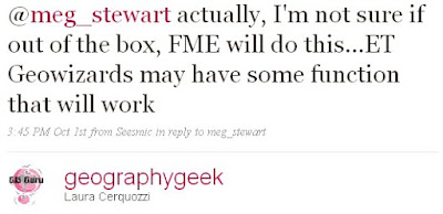
That seemed like reasonable advice. I'd give the ET Geowizards extension a try, see if there was a free trial version to use.
Ready for work with all my new advice from the geospatial community, I came into the office Friday afternoon and popped my head into the office of the folks having the geospatial issues. They had already figured it out using Map Maker Pro. I have never used Map Maker Pro not had I even heard of it prior to coming to the UWI. Map Maker Pro is a GIS software for Windows OS created out of the U.K. They must have hopped on that domain name early! There is also Map Maker Gratis. Looks like I'm learning a lot already!
To make this Map Maker Pro solution work for this problem, one needs to create a comma-delimited table that has the Direction and Distance for each point. Ideally, one also has a description-of-point column. In Map Maker, one has the known point, or base station, that one points to and then runs a calculation on the created table. The output file (in DBF format) gives the latitude and longitude of each point.
This problem goes down in the annals of Why Does It Have to be so Hard? using tools we already have. I scratch my head in wonder.
ADDED Oct 6, 2009: New information on how to calculate this problem using ArcGIS.
Friday, October 02, 2009
Geospatial Conference a Success
 Last week was the NITLE Geospatial Technologies in the Liberal Arts conference at Skidmore College. I mentioned the conference agenda here. Please read about the details of how the conference came out here at the NITLE blog and written by Sean Connin. Talks on open source GIS options, web mapping, virtual globes in teaching, mobile technologies, geospatial literacy, birds of a feather, mingling with other geospatial technologists, plus a keynote by Adena Schutzberg, Executive Editor of Directions Magazine. I wish I could have been there. Well done, folks!
Added Oct 5, from All Points Blog, Directions Magazine conference by Adena, with the great line at the end: "many even understand how (GPS) works. But, no one really knows what : A recap of the NITLE GeospatialGIS is." Too true.
Thursday, September 24, 2009
Tablet PC News...NOT from Apple
 There was a minor amount of techno buzz a couple of weeks ago here and here when Apple raised the notion that they, in fact, were going to be coming out with their long-last tablet PC offering. I didn't really believe it because it is something I've heard since getting our marvelous Windows-based Compaq/HP TC1100 tablets back in 2004. Many higher educators kept holding their collective breath waiting for the Mac version.
I did blog about the first semi-real version of the Mac tablet. I didn't bother with the recent rumors.
But this new tablet PC buzz out of Gizmodo and video shows what looks like a larger iPhone, a slicker-looking Kindle/e-book reader and a touch/pen-based device. Maybe it's like an affordable and mini version of the Surface? But it's called Courier and comes from Microsoft.
Looks like the Courier, if the rumors are correct, could be a pretty nice mobile device. Doing GIS with a finger touch, anyone!?
Thanks, Tablet PC blog and OgleEarth (I didn't know Stephan Geens was a tablet enthusiast!) for pointing this out.
Friday, September 18, 2009
Coral Reef mapping with ReefBase
 I was directed to the ReefBase website while contributing to a colleagues research and found it useful not only for the ReefGIS Online mapping application but also for the ability to download GIS data sets. The online mapping application made it easy for me to determine if the available data suited my needs.
Thursday, September 17, 2009
Dutchess County's website nationally recognized

The Center for Digital Government and the National Association of Counties (NACo) recognized the Dutchess County government as the second-most digitally advanced county government in the country. Interactive website mapping applications, ParcelAccess and GeoAccess helped contribute to the popularity of the Dutchess County website. ParcelAccess enables users to easily obtain tax parcel and assessment data. GeoAccess provides selectable layers on various infrastructure throughout the county including schools, recreation sites and historic sites.
Thanks to the Dutchess County Planning and GIS Department for providing such a great resource!
Thursday, August 20, 2009
A Little Press for a Geospatial Instructional Technologist
 My local newspaper, the Poughkeepsie Journal, published an announcement about my upcoming Fulbright to the University of the West Indies in yesterday's paper and All Points Blog got a hold of it. Thanks for posting this, Adena! I hope to meet you some day soon.
No, you do not have to be a faculty member to earn a Fulbright grant.
But I found this blog post from a tweet from FulbrightSchlrs, who wisely thought to send this info along to @vassarnews. Hint!
Tuesday, August 18, 2009
NITLE GIS Conference Agenda Announced
 As mentioned in a previous post, NITLE will hold a Geospatial Technologies conference September 25 to 27, 2009 at Skidmore College. This conference is designed for NITLE school members who wish to learn more about geospatial technologies and network with those who support and do GIS and other geospatial tools.
The conference planners, all terrific and hard-working geospatial professionals at liberal arts colleges, designed an excellent program. To review the agenda, please visit the Geospatial Technologies conference website or go directly to the agenda document. This is a working document and may be subject to minor change.
The deadline for registration is August 28th, 2009 - one week from this Friday. For your convenience, 20 rooms have been reserved at the The Saratoga Hilton at a special NITLE rate of $179 (plus sales and occupancy taxes), please call 518-693-1005 by August 25, 2009. After August 25th the rate and room availability cannot be guaranteed.
For more information, contact one of the conference planners:
Andy Anderson, Amherst College
Jon Caris, Smith College
Alex Chaucer, Skidmore College
Jenni Lund, Wheaton College
Sharron Macklin, Williams College
David Tatem, Trinity College
Subscribe to:
Posts (Atom)


