List of GIS Data and Web Sites For Your Final Projects - GEOG 224
1. If you want to use US Census Data, keep in mind that the Sci Vis Lab and the GIS lab have a lot of useful 2000 Census data already loaded. These data are from the the Educational DVD distributed by ESRI. The shapefiles start with the 'educ_' identifier and come in polygons of state, county, tract, zip code, and blockgroup. (Look in this folder for the data C:\GIS_class\census2000)
Because there are over 1,000 demographic variables in the Educational dataset and almost all have cryptic short names, please take a look at the Excel file called "CommunityInfo Complete Layout.xls" to get an idea what the names mean. Be sure to click on the
blue EDUC link in the Excel table (see the
green circle below)
 For instance, if you have a tract file open in ArcMap and you wonder what "HGRPL1_CY" means, go to the Excel table to see that it means "2004 HHs: Community LifeMode Group L1 (High Society)." You can ignore this category and should use variables that have a meaning you can understand.
I would go to the Excel table and find the data I was interested in mapping. For instance, "PCI00" is "2000 Per Capita Income" or "P00A15_19" is "2000 Total Population: Age 15-19" or "GQFES00" is "2000 Female Population in Group Quarters" Be sure to keep in mind that we have the data for EDUC only (look under Database Name in the table). If you want more 2000 US Census data you can go to the American Factfinder page.
 2. The American FactFinder web site offers all the US Census Bureau data you could dream of.

Make sure you're on the data Download page and then click on the Summary File 1 (SF1) link and follow the directions. It's a bit of a tricky site to use but follow the steps and you should get the data you want for the geographic area you are interested in. The data are delivered as csv or xls, both should be readable in ArcMap. See this link for more information on working with those file types.
3. Now look at the right side of this blog, under Favorite Data Sources. You'll find some sites that I like to refer to.
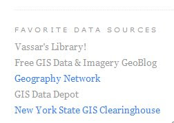
Through the Vassar Library site, under Digital Map Collections, you can find some useful map sites including a link to the David Rumsey map collection where you can find many archival maps that are scanned and georectified.
Look at Free GIS Data & Imagery GeoBlog to get a quick idea of what's what, especially by location. Look at what he has for New Jersey.
The Geography Network offers a lot of freely downloadable data.
The GeoCommunity (GIS Data Depot) is a place to find international data. You need to register, but they do not spam you, or at least, they do not spam me.
State GIS data clearing houses are great places to get some local or regional data. Here is the link the the New York State GIS site. Or if you want another state, use Google. Countries may have rich GIS data sources, freely available, if you do a little searching.
4. If you want historical US Census data, go to National Historical Geographic Information System (NHGIS). Click on this link to get a step-by-step on how to use NHGIS site. Data go back to 1790.
5. The National Atlas Map Maker is another good site for spatial data.
6. Later in lab time, you will work with the USGS National Map Seamless dataset
7. Not Discussed in Class but perhaps still useful:

In ArcMap, go to Add Data (plus sign) and go to -> Look in -> GIS Servers. Add the Geography Network Server hosted by ESRI. Here you can load some data and I think you can download it. At the very least, you can use these data in your final maps and make analyses with the data sets. If you find something you'd like to download in one of these sets, send me an email and I can help you figure out how to get at the data.
 If you're in search of LiDAR data, I recently heard of a couple of sites that may be of use. The OpenTopography Portal is a useful site produced by the GEON Project. Here is information about the OpenTopograghy Portal from the site:
 The OpenTopography Portal
 Thanks to Dave Tewksbury of Hamilton College and Peter Lea of Bowdoin College for posting about these sites.
 MapAction


