Virtual Globes Symposium (email from Patrick Florance)
Hello,
I just wanted to make everyone aware of an upcoming symposium on VirtualGlobes in educational technology (i.e., Google Earth, NASA World Wind, ArcGIS Explorer, etc.). It's a really good group of speakers, and therewill even be a guest appearance by NITLE's very own celebrity Jon Caris of Smith College. Please feel free to circulate. The announcement follows.
Thank you,
Patrick
Will do, Patrick!
Registration is now open for NERCOMP's upcoming workshop:
*"VIRTUAL GLOBES: GIS 2.0"
DATE:
*January 19, 2007
*DESCRIPTION:*
Virtual Globes are being used increasingly by the news media; federal, state and local agencies; teachers; commercial agencies, and by people of all ages for personal use. A Virtual Globe is a three-dimensional software interface that allows users to observe and manipulate representations of the Earth or other worlds from a variety of views over the Internet. Users can often customize their own Virtual Globes by adding place makers or other geographic information such as satellite imagery, buildings, roads, demographics, etc. Virtual Globes have enormous potential for incorporating spatial information and spatial reasoning within a learning environment. A variety of Virtual Globe products and applications will be presented followed by a discussion ofthe various technologies.
For a full schedule and registration information, please go to:http://www.nercomp.org/events/event_single.aspx?id=643
*TIME:*
9:00- 3:15 (Coffee and Registration start at 8:00)
*PRICE:*
NERCOMP Members: $111, Non-Members: $211
*LOCATION:*
Southbridge Hotel & Conference Center Southbridge, MA.
Patrick Florance
GIS Manager & Senior GIS Specialist
Academic Technology
Tufts University
16 Dearborn Rd.
Somerville, MA, USA 02135
patrick.florance@tufts.edu
phone: 617.627.4235
Wednesday, December 20, 2006
Tuesday, December 19, 2006
More on Area Calculations
Remember when Keri wondered how to measure an area in her map?
Well, Kirsten wondered the same thing (what a concept...needing to know an area of a region in a map using GIS!! Why must it be difficult!?). She found an ArcScript called Graphic Measures (ArcMap 9) Worked like a charm. A separate window pops up and measures the length and area of the graphic that you've draw in your map. No need to make a shapefile.
http://arcscripts.esri.com/details.asp?dbid=13515
Tuesday, December 12, 2006
What's Harvard Up To These Days?
Seems Harvard University dropped the Geography department back in 1948. Now, thanks to geospatial guru and Harvard grad, Jack Dangermond, they have a swanky new GIS lab.

Hello, Geotech
"Modeling our world," geography returns to Harvard
by Christopher Reed
Take your geographic information system (GIS) for a spin around the block. It’s easy. Sit at your computer, which you have loaded with GIS software, and call up on the monitor a street map of Greater Boston. Superimpose on it a second map showing the household incomes of the citizenry. Those with the best dental work are in the suburbs, struggling scholars in Cambridge, the poor in the inner city. Add a third layer of census ethnicity information. All these data are public and readily available. Top it off with lines and dots showing Massachusetts Bay Transportation Authority bus routes and subway stations. Almost everyone is near a stop except in one big chunk of the city south of downtown. Your multilayered map will reveal to you what you might not have otherwise perceived, that the poorest, blackest Bostonians, in Roxbury and Dorchester, the ones least able to afford cars, are the least well served by public transportation.

Saturday, December 09, 2006
And Finally...ESRI has released their Virtual Globe - ArcGIS Explorer
ESRI is pleased to announce that ArcGIS Explorer is now available for download. Use your ESRI Global Account to log in and download ArcGIS Explorer.
ArcGIS Explorer is a lightweight desktop client for ArcGIS Server, providing a way for you to publish ArcGIS Server capabilities within your organization or to anyone on the Web. ArcGIS Explorer is freely distributable and does not require any other ESRI software.
Using ArcGIS Explorer you can connect to content published by ESRI and others and fuse it with your own ArcGIS services or local data. You can create your own content or tasks for ArcGIS Explorer by authoring globes and tasks using ArcGIS Desktop, then publishing it to ArcGIS Explorer via ArcGIS Server.
Ready-to-Use Globe DataTo get started with ArcGIS Explorer, you can access a collection of ArcGIS Online globes including worldwide streets, terrain, boundaries and labels, political maps, physiography, and more. All of these are meant to form a foundation on which you can publish your own content. Once you have downloaded ArcGIS Explorer, you can connect to these via the ArcGIS Explorer Resource Center.
Centrally Managed TasksYou can use ArcGIS Server to publish custom tasks for ArcGIS Explorer. Tasks may include advanced geoprocessing and GIS analytic capabilities such as viewshed analysis, terrain profiling, and other ArcGIS Server functions without the need for programming. These tasks can be saved in specific maps for specific users, or they can be delivered independently. Because tasks are centrally managed on the server, once you make an update to a task, it's automatically propagated to all users that are connected to it.
Customizable and ConfigurableArcGIS Explorer can be customized to suit your preferences and needs by changing the startup globes and tasks which are available, changing the look and feel of the application, or authoring custom tasks.
ArcGIS Explorer also includes a software development kit (SDK) that can be used to extend tasks or can be used to implement completely custom tasks that are driven by other Web services.
Learn MoreLearn more by listening to a podcast [MP3 - 7.04MB] from ESRI.
Friday, December 08, 2006
ANNOUNCEMENT -- GIS Conference at Skidmore: January 10
We plan two sessions at our Winter regional conference. Both will be discussion-based. The morning session will be on specific applications of GIS that go beyond the common applications. The afternoon session will be a discussion about how to handle/integrate such popular applications such as Google Earth with GIS. The tentative agenda will be:
9:30 AM Welcome and refreshments
10:00 AM to Noon: Creative, new, different applications of GIS.
Noon to 1:00 PM: Lunch
1:00 – 3:00 PM: How should academic GIS programs handle or integrate such web-based software such as Google Earth, NASA World Wind, etc.
If you would like to give a brief presentation of an application of GIS that may be rare or unique, or if you are integrating Google Earth, World Wind or other web-based geographic programs, let me know so that I can place you on the program to get the discussion going on these issues.
Please send your thoughts to me, rjones@skidmore.edu
We look forward to seeing you on Wednesday, January 10th. More details will follow in a couple of weeks."
Monday, December 04, 2006
A Breakdown of Virtual Globes and their Compatibilities with a Mac or a Windows Machine
"Ogle Earth" - 1 new article Run ArcGIS Explorer on your MacHere's a fun GIS party trick: Run ArcGIS Explorer as an application inside Mac OS X. While you're at it, run SkylineGlobe as well: (Click on the image to enlarge)
No, they didn't just come out with Mac versions. Instead, Parallels came out with an update to its excellent Windows virtualization software for Mac. Two new features were added: The ability to run individual Windows applications just like any Mac application right in the OS X GUI, and the ability to use the Boot Camp partition with Parallels. The first feature makes it look great, but what does the second feature mean? Apple already lets you boot into a separate partition on your Mac where you can run Window XP or Vista natively on the Intel Core Duo processor. Parallels, meanwhile, lets you create and run virtual disks with all kinds of Windows or Linux installs, and with virtually no speed penalty. With this latest update, Parallels now also lets you run your Boot Camp install from within Mac OS X, simultaneously. Before, you had to reboot if you wanted to use Boot Camp. There is just one thing missing, still, in Parallels: 3D hardware acceleration. You do get full OpenGL and DirectX support in Boot Camp, so you can still reboot into it if you really want to access 3D functionality on your Mac, but that takes minutes. Parallels promises to add 3D hardware acceleration support in the coming months, but until then, here's a rundown of compatibility for the current set of virtual globes. Mac OS X: Windows via Parallels in Mac OS X: Windows in BootCamp: So although NASA World Wind and Microsoft Virtual Earth 3D are currently not accessible via Parallels' solution, this will change in a matter of months, either because the Java version of NASA World Wind has come out, or because Parallels adds 3D hardware support to their product. None of this should mean that developers can stop developing for the Mac, of course. To use Parallels or Boot Camp with Windows, you need to own a copy of XP or Vista, and that's not cheap. |

Wednesday, November 22, 2006
Google Earth KMLs can now be viewed in Google Maps


Monday, November 13, 2006
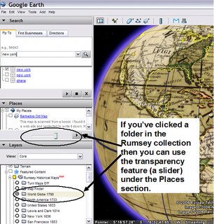
Google Earth and Old Maps?!? Be still my heart!
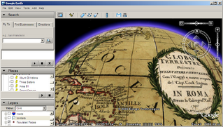
Google Earth in 4D by ZDNet's Garett Rogers -- Google skipped right past the third dimension and landed directly in the fourth (time) by offering historical maps on Google Earth. Now you can travel back in time — for example, I am looking at the globe of 1790. Don't expect detailed high resolution photography from days gone by, but it's still interesting to see [...]
So, in order to make these fantastic archival maps transparent, look at the image below. If you cannot read it, you have to select the folder (highlight it) in the Rumsey collection under the Featured Content and then up in the Places section you'll see the Transparency slider.
Saturday, November 04, 2006
In this lab we’ll perform some of the analytical steps you can use to understand the distribution of stream quality parameters, or of risk factors that influence a stream.
The directions in this lab are somewhat terse, in part because I think much of the methods involved are communicated easiest verbally, and in part because it takes a lot of precious time to read directions in the current context. Please do your best to remain flexible, and if you find yourself becoming frustrated with the software, consult with your neighbors and the instructors to sort out a solution. Often we learn a great deal by making mistakes.
We will practice importing points, changing symbols, buffering and clipping, and basic map design as a group. Then you will have time to work on your own. We’ll try to include some show-and-tell to display your work to the group.
Taking notes: it’s hard to pause for note-taking, but it’s a good idea! You will not remember the steps taken today if you don’t take notes. I strongly recommend note taking!
Here is where you’ll find the tools you need:
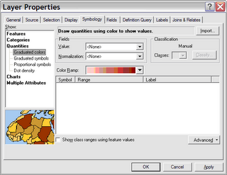
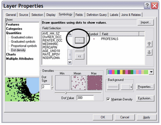
Symbology: change the colors, sizes, grouping, and so on for point, line, or polygon features by opening the Properties window (double-click or right-click on the layer name), then click on the Symbology tab
Buffer tool: in the Toolbox (click on the red toolbox button to open it), search for the Buffer tool. (normally, use Dissolve Type: ALL)
Clip, Dissolve, and Calculate area are also in the Toolbox (search by name)
To examine attributes of selected features: open the attribute table of the layer: right-click on the name of the layer. You can then use Statistics to calculate mean, min, max, and histogram.
Screen capture windows (to paste in a word document): Alt-print screen copies the active window, such as a histogram report. Ctrl-V to paste in a word document.
Plot the Casperkill sample sites as points (“events”), using their coordinate locations.
Display the points using point symbols graduated to express data values.
Buffer the stream (at 50, 100, 500, 1000 m).
Clip digitized land use by the buffered area, then calculate area of different classes of land use.
Create a new point shapefile and identify risk factors to the stream, and show those risk factors to the class.
Produce a map (without air photos, but with a legend and scale bar) showing your findings from some (probably not all) of the work above. Write a 1-2 page analysis that explains what you can interpret from what you see in the map. You will be graded on the thoughtfulness of your writing, not on the depth of your GIS work. Your GIS analysis may be very simple, but try to think thoroughly about the evidence you have, the questions it raises, and the information that can be found in it about environmental factors affecting the stream.
As you write, practice writing cleanly and accurately. Stick close to the map and avoid sweeping generalizations, sloppy grammar, and other careless habits. Any figures or tables appended to your written work should have captions, and you should clearly explain what each figure or table shows and what the reader is to learn from it.
digitized data values:
1 = trees
2 = neighborhoods
3 = parking lots
4 = mowed grass
5 = open water
90 = roads
Thursday, November 02, 2006
Five College GIS Day - Pioneer Valley, Massachusetts
If you are nearby, or in the region, or even farther away, you are
invited to attend our Five College GIS Day!
All events are on November 8, 2006 at Amherst College in Amherst,
Massachusetts (72° 31' W, 42° 22' N).
Full information can be found here:
http://www.amherst.edu/it/ats/gisday/
You can contact me if you have other questions, or just to let me
know you're coming (and maybe bringing a poster, hint, hint).
The schedule is as follows. All events are free and open to the public.
Thanks,
-- Andy
****************************************************
10:30 AM - 11:30 AM
GIS and Demography: Methods, Analysis, Results
Dr. Ian Gregory, Digital Humanities-Department of History, Lancaster
University, UK
A seminar for experienced users of GIS, applicable to history,
sociology, economics, et al.
12:00 Noon - 12:50 PM
Teaching History with Geographic Information Systems
Prof. Robert M. Schwartz, E. Nevius Rodman Professor of History, Mt.
Holyoke College, MA
Discover how GIS can help introduce quantitative methods into history
and other subjects.
2:00 PM - 4:00 PM
GIS Poster Session
Everyone is invited to set up posters demonstrating academic
applications of GIS.
Visitors can take a short poster quiz to be included in a drawing to
win a door prize, including a GPS receiver!
4:00 PM - 5:00 PM
GIS and the Exploration of French Society and Culture
Prof. Joel Goldfield, Chair of Modern Languages and Literatures,
Fairfield University, CT
Learn how students used GIS-based projects to collaborate across
multiple disciplines.
7:30 PM - 9:00 PM
The Journey of Man: A Genetic Odyssey
Dr. Spencer Wells, Explorer-in-Residence, The National Geographic
Society,
and Project Director of the Genographic Project
Roughly sixty thousand years ago our ancestors began to spread out
across Africa and throughout the world. Our keynote speaker has
mapped this prehistoric journey using cutting-edge genetic research
informed by archaeology, linguistics, and climatology.
****************************************************
P.S. I know we're early, but November 8 fits our academic schedule
better :-).
Andy Anderson, Ph.D.
Mathematical and Spatial Data Analysis Specialist
Academic Technology Services
Amherst College
413-542-2255
GIS Demos at Cornell Cooperative Extension - Millbrook, NY
From: Stacy Hoppen
Sent: Wednesday, November 01, 2006 2:22 PM
To: GIS SIG
Subject: Wed Nov 8, 2006 - 6:30 pm - 8:30 pm - Demos of Free GIS Software
To: GIS SIG
Reminder for our event next week, on GIS Day!
Wednesday Nov 8, 2006 - 6:30 pm - 8:30 pm
Conference Room A
Farm and Home Center
2715 Route 44, Millbrook, NY
Demonstrations of Free GIS Software
Review and demos of some of the free GIS software packages available for
download from Internet. Demos will be about 20 minutes for each software
package.
Google Earth and Google SketchUp - Joe Heggenstaller
3DEM - 3D visualization software - Stacy Hoppen
Build Out Analysis software from University of Vermont - Mark Doyle/Stacy
Hoppen
Quantum GIS - Jerry Ottaway
MicroCAM - Stacy Hoppen
Feel free to pass this on to anyone who may be interested. Hope to see you
there!
Stacy
Stacy Hoppen
Interim GIS Project Coordinator
Cornell Cooperative Extension, Environment Program Farm and Home Center
2715 Route 44
Millbrook, NY 12545
845-677-8223 x148
845-677-6563 fax
Friday, October 20, 2006
Calculating Area in ArcMap - Why should it have to be so hard?
I got a call from Keri Van Camp in Biology who wanted to know if there was a way to easily calculate the acreage of a region on a map. I assume she meant to draw a polygon and have an answer spit out in a window next to the polygon. Seems a simple GIS task to me. I recall that XTools used to be able to do something like that, but it is no longer free. It's available for a 30 day trial.
XTools costs $1,500.00 for academic institutions. I will look into getting this for all of the labs that have ArcMap in them (GIS lab, Sci Vis lab, Mobile mapping lab number one, Mobile map lab number two (Vassar Farm tablets)).
This is what they say about XTools: "Originally developed as a set of useful vector spatial analysis, shape conversion and table management tools for ArcView GIS 3.x. XTools extension was then converted by Data East to ESRI ArcGIS environment and now is re-designed, enhanced and extended as XTools Pro to get to the newer level of functionality and performance."Anyway, back to trying to get Keri an answer, this is what I sent her:
Try one of these two ESRI ArcScripts:
Number 1
http://arcscripts.esri.com/details.asp?dbid=13941
ESRI Description: Adds and populates ACREAGE and/or AREA field to the attribute table of a dataset. Will properly calculate acreage for projected data, regardless of the linear units (meters, feet) used in that projection. Some other scripts I've seen DO NOT account for the projection and will give you wrong results. Tested on ArcGIS 8.1 thru 9.0. Includes a readme file showing how to install.
Number 2
http://arcscripts.esri.com/details.asp?dbid=13910
ESRI Description: The Areal Interpolator is an extension that uses simple areal interpolation to calculate a variable for a given area. The tool assumes the variable is distributed uniformly over the area.
Go to http://www.healthgis-li.com/researchers/User_Guide.pdf (pg 153 of 189) for complete instructions on how to use the Areal Interpolator extension.
Thursday, October 19, 2006
Google Earth Pro and New Orleans Data
We now have Google Earth Pro in our GIS lab. (Thank you to Google's Dennis Reinhardt and National Geographic for the grant.) The best thing about this upgrade is that we can load GIS files directly into Google Earth. Shapefiles, MapInfo files (remember those?) and GoeTIFF files are all options. You can also make movies. I want to try to do a demo on movie making for the department.
Also, if you want to use some detailed data for New Orleans immediately following Hurricane Katrina, log in as either 'Katrina - NOAA' or 'Katrina - ImageAmerica' as shown below.
Then Zoom to New Orleans.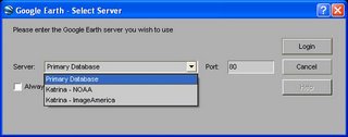
Monday, October 16, 2006
Mid-Hudson GIS Users Group - First Meeting
On October 16, we had a first meeting of the Mid-Hudson GIS Users Group. An email went out last June to invite participants from local area colleges and universities (Bard, Marist, Dutchess, Community College, Ulster County Community College, US Military Academy , SUNY New Paltz, and Mount Saint Mary College). I got back responses from three of these schools. One had to cancel last Friday.
Today’s attendees:
Meg Stewart, Vassar College
Brian McAdoo, Vassar College
Mark Halsey, Bard College
Jennifer Peters, Bard College
Sharon Kopyc, Bard College
Mark Lindeman, Bard College
Susan Winchell-Sweeney, Bard College
Christopher Lindner, Bard College
Sarah Love, Marist College
John Brockhaus, US Military Academy (unable to attend)
If you’re interested in the email list, please contact Meg Stewart.
The meeting got underway at 11:30 am in Ely Hall’s student lounge with a brief introduction by Meg Stewart. Everyone introduced themselves and said a little bit about what they do with GIS.
We then took a tour of the GIS facilities in Ely Hall. Meg talked about the GIS lab and the history of GIS use and teaching with GIS at Vassar. The department of Geology and Geography has taught with GIS since 1994 and the GIS lab was built in 1998. Meg also showed the group Mary Ann Cunningham’s research lab and the tablet PC lab.
We then got lunch and ate in the student lounge. Meg talked about what she thought was the appeal of organizing a GIS User’s Group in the region and how there are unique needs on college campuses for GIS support. Meg mentioned the original email that went out with ideas for topics of discussion for such a group: data sharing, computer lab management, supporting GIS projects in teaching and research on campus, software licensing issues, collaborative projects, and data management. Meg got the idea from attending a NITLE GIS workshop in March that discussed Managing and Supporting GIS on small campuses. NITLE is the National Institute for Technology and Liberal Education.
Mark Halsey thought this Mid-Hudson GIS Users group might establish at the local level what NITLE has at the national level.
Sharon Kopyc thought maybe this group could get a NITLE workshop organized to come to either Bard or Vassar and then open it up to the Users Group members. Neither school has had one yet. Mark H. thought that was a good idea but the group should get more established before pursuing the workshop.
Sarah Love said she was the only one on her campus (Marist) to support GIS. She wondered about who to talk to on her campus to increase the exposure, should she do demos, or GIS Day activity? She wondered about the downloading of data sets and could that be best organized through the library?
Meg said she’d send the link to the NITLE e-journal Transformations because it has many articles on how small colleges support a GIS program.
Sarah mentioned the Institute for Geospatial Technologies at Cayuga Community College. Perhaps partnering with them in some way?
Meg mentioned the Skidmore GIS workshop that met in June 2006. Sharon and Mark H went to this. Nick Napoli is the contact person at Skidmore College.
Mark Lindeman talked a bit about using the ICPSR (Inter-university Consortium for Political and Social Research) data. He uses the data all the time. Meg thought that ICPSR data might be a useful way to get social science faculty members, who are using these data already, to use GIS software to analyze the ICPSR data.
Sharon talked about Google Earth and reaching faculty members with Google Earth and other virtual globes.
Mark H wondered if we should work on bringing Google Earth to our campuses in a concerted way. Working on that technology as a starter rather than focusing on GIS workshop solely.
Sharon thought we should contact Diana Sinton, GIS Coordinator at NITLE. To ask how her Web-Mapping: Exploring Browser-Based Applications as Teaching and Learning Tools workshop went. Sharon also mentioned Jennie Lund at Connecticut College as a good resource.
Brian McAdoo mentioned looking into faculty enhancement grants, whether at ESRI or elsewhere. Brian said that ArcGIS is a tremendously difficult software to work with and that if a faculty member is going to try to learn it, he or she will need the time to devote to just learning the software. That it’s the kind of thing you learn in graduate school because you have the time, but once you’re out and teaching, you really don’t have the time to spend with the software if you’re teaching and doing your research at the same time.
Meg mentioned that what she sees at Vassar is that the students are flocking to GIS classes and that the enrollments have doubled. Vassar has had workshops for faculty, GIS Day activities, GIS speakers and there is always enthusiasm by faculty members but rarely a real follow-through with learning and using the GIS technology on the part of faculty members. There are exceptions to this rule. Meg thinks the growth of GIS at Vassar has come primarily from the students and sees the students leading the faculty to GIS.
We then reconvened in the GIS lab for a few brief discussions of projects.
Susan Winchell-Sweeney discussed the paper that she’ll give at the New York State GIS Conference later this month. She and a colleague mapped paleoindian archaeological sites from projectile point findings in the Hudson River Valley area near Bard College. The mapped the locations of archaeological sites versus chert-bearing bedrock and soil types.
Jennifer Peters has been working for the Environmental Protection Agency the past five months and has been using GIS to map probable locations of wetlands. Looking at hydric soils, bedrock fractures, and slope she is plotting the locations of possible wetlands. She is now ground-truthing her GIS analysis.
Meg talked about the Vassar GIS blog she started as a way to put exercises for faculty member’s classes up on the web. These exercises can be used at a later date by anyone. It is also a way to answer frequently asked questions and get that information to GIS users on campus. There are also links to data locations, virtual globes, other GIS blogs, information on tablet PCs, the GIS lab schedule, and links to vintage map sites.
Meg also showed how the tablet PC works with the ArcGIS software. The software is tablet PC-enabled and mapping can be done on the screen with a digitizing pen. You can also connect a GPS receiver to a USB port and stream locational data right into ArcGIS. Here’s a link to a blog entry from the Academic Commons she wrote recently about geospatial awareness thorugh using tablet PCs and GIS.
With a brief mention of thinking of ways to bring more local colleagues into the group and keeping in touch by email, we ended the meeting at 1:45 pm.
Thursday, October 12, 2006
Exporting Shapefiles to KML format - Export to KML 2.3.4
Here's the ESRI link to the that nice ArcScript for ArcMap 9.x. You can export a shapefile into a KML file for Google Earth viewing right from ArcMap. I'm giving the ESRI link so they can keep track of the downloads. They like that. There seem to be endless examples of these scripts. I'll try more as time goes on.
Tuesday, October 03, 2006
Environmental Sciences in the Field -
Exploring the Impacts of Katrina GIS Exercise
A good way to understand the effects of flooding after Hurricane Katrina is to map data such as land surface elevation, demographic information, and location of important infrastructure, such as hospitals and schools. In today's exercise, we will ask you to choose a portion of New Orleans, map several variables, and report to the class on your assessment of the areas inside and outside of the flooded areas.
Find a partner. You will work with this person in presenting your findings, but you may choose to work side-by-side as you look at the maps. Find the ArcMap project New_Orleans_exercise.mxd, which will be located in the directory C:\classes\Louisiana. Explore the layers available to you. Some of the main layers you'll be using include the following:
We'll look at a variety of demographic variables in the census data first as a group.
Focus on Statistics for two Areas
Now we'll focus on two neighborhood areas. Pay attention to the methods we use here because you'll have to work on your own later.
To narrow our focus some, we'll examine the Lower Ninth Ward area and the Lakeview area in order to describe similarities and differences in distributions of census variables.
Select the Lower Ninth area neighborhoods: open the attribute table for the NO_neighborhoods layer (right click on the layer name > open attribute table). Select the Lower Ninth Ward, St. Claude, and Bywater (hold down the Ctrl key to select multiple records in the table).
Now get the census information for those neighborhoods: go to the Selection menu > Select by Location. Check the boxes to select features from the CensusDVD layers that intersect the features in NO_neighborhoods. Make sure the Use selected features box is checked on and make sure to check all of the CensusDVD_bg_NewOrleans layers. (See figure for example.)
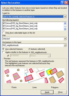
Now select any one of the CensusDVD layers in the map legend. Open its attribute table (right click > open attribute table).
Find the field called AVGHHINC. Right click on the field name, then click on Statistics.
Write down the Average household income for these block groups in the table below.
Now select the Lakeview, Lakewood, and West End neighborhoods in the NO_neighborhoods layer. Then repeat the selection of census data to get a mean for those three neighborhoods. Make sure you know where those neighborhoods are. Write down the average household income for this area. Now summarize five other variables by neighborhood area and add them to your data table (there are extra spaces you may not need in the table). Descriptions of the different census variables can be found in the NO_GIS_project_census_labels.csv data table.
| Variable name | Lower 9th area | Lakeview area |
| Avg household income | ||
Comment on what you learn from these comparisons:
Independent Work
Now do the same selection process for the flooded and unflooded areas: You'll select features this time by whether or not they intersect the flood layer, "Flooded area." Find 5 factors you think are important in explaining flooding effects on the city's population. Variables could include such factors as depth of flooding in different areas, distributions of hospitals and schools, and locations of transportation infrastructure, as well as the census data. With your partner, thoroughly examine your chosen factors and prepare to explain your findings to the group. Your explanation should show that you've thoughtfully contemplated the implications of the features and variables you're discussing, and you should consider relationships between your variables/features.
For your explanation, detail what you were looking at and how you carried out your analysis along with your results. Include screen captures of your maps (including legends) and paste them and your text explanations into this document. When you're finished, upload your copy to the Digital Dropbox on Blackboard. You will have the opportunity to show your word document to the class next week. We'll allot about 5 minutes per pair for the show-and-tell.
MapIt - GIS software for Tablet PCs
I heard about this software from NITLE's Diana Sinton. MapIt was developed for mapping on a tablet. Can't wait to try it out. Here's a link to the article by Mauro De Donatis and Lorenzo Bruciatelli in Computers & Geosciences. I got in touch with the De Donatis, so see the exchange below.
Date: Oct 3, 2006 12:35 PM
Dear Mr. De Donatis,
I read with great interest your paper (with L. Bruciatelli) in Computers & Geosciences. I did not see how to obtain a copy of the software Map It. I would love to try it on tablet PCs. We've been using ESRI's ArcMap on Tablet PCs for mapping and for teaching students how to map, but Map It seems very intuitive. Could you send information on how I can get a copy of it to try out? We have twenty tablet PCs and, if we like Map It, we might want to put it on all of the tablets. So, please let me know the cost of loading the software on twenty machines.
Many thanks,
Meg Stewart
Date: Oct 3, 2006 1:07 PM
Dear Meg,
I am very pleased to get your message.
You can directly go to
http://www.uniurb.it/ISDA/MAPIT/index.htm
and you will find the way to download it.When you install Map IT in your tablet you can use the demo version.This version can do everything except saving.
We are in a University and we can not sell anything. Moreover I have only the intellectual rights not the commercial ones.
About costs. As I told you, I do not sell the sw. However I know the a license costs 1,200 Euros, but I am sure the cost for 20 machine will have a very strong reduction.
I will ask to the reseller and I let you know.
thank you and regards
Prof. Mauro De Donatis
Universita' degli Studi di Urbino "Carlo Bo" Facolta' di Scienze Ambientali - Campus Scientifico -
Loc. Crocicchia - 61029 Urbino - Italy
Tel. & Fax.: (int.+) 0722.304295 - E-mail: dedonatis@uniurb.it
http://www.uniurb.it/ISDA/Pagine/home.htm
Friday, September 22, 2006
MAKING MAPS USING CENSUS DATA
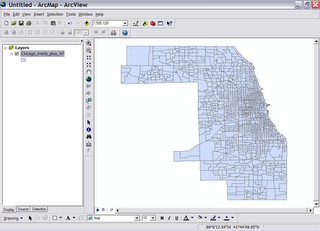
The data for this exercise are located on all of the computers in the GIS lab – Ely Hall 114. The data, called ‘shapefiles,’ are found in C:/classes -> GEOG250. When you open the GEOG 250 folder, you will have a choice of city names – Chicago, New York City, and Los Angeles. The data you will need for your map analysis assignment are in those folders. You can go to the end of this handout and see a list of data available for each of the cities.
In case you need to get the data for this exercise (zipped files)-->
| Chicago | Los Angeles | New York City |
Here is a general “how to” guideline for making your maps. The maps you will make are called ‘choropleth’ maps which are maps based on predefined areal units, such as states, counties, census tracts, and colored to indicate low to high values by using a graded or ramped color scheme.


Data Columns in Each Shapefile
| GIS Header | Explanation |
|---|---|
| FID | GIS Use |
| Shape* | GIS Use |
| ObjectID | GIS Use |
| STATE_FIPS | State Numeric Code |
| CNTY_FIPS | Country Numeric Code |
| STCOFIPS | Combined State and County Codes |
| TRACT | Tract Identifier |
| FIPS | State, County and Tract Numeric Code |
| POP2000 | Population 2000 |
| WHITE | White Population |
| BLACK | Black Population |
| AMERI_ES | American Eskimo Population |
| ASIAN | Asian Population |
| HAWN_PI | Hawaiian/Pacific Islander Population |
| OTHER | Other race (than those listed here) Population |
| MULT_RACE | Multi-race Population |
| HISPANIC | Hispanic Population |
| AGE_65_UP | Population Age 65 and Over |
| MED_AGE | Median Age |
| AVE_HH_SZ | Average Household Size |
| OWNER_OCC | Owner-Occupied Housing |
| RENTER_OCC | Renter-Occupied Housing |
| MEDHHINC | Median Household Income (1999$) |
| PERCAPIN | Per Capita Income (1999$) |
| AGE_UND18 | Population Under Age 18 |
| RATE_BPOV | Below Poverty Rate (in percent) |
| NODIPLOMA | Population without a High School Diploma (Age 25 and Over) |
| PROFESNLS | Population with Master’s, Professional or Doctorate Degree (Age 25 and Over) |
| POPOVER25 | Population Over the Age of 25 |
Tuesday, September 19, 2006
Some Tips on Using the Tablet PC with GIS Software (ArcGIS 9.1)
Using the GPS receiver
1. Connect the GPS receiver to the USB port on the side of the tablet PC. A red light should start blinking on the receiver indicating that it is being powered from the tablet.
Hold the GPS receiver until the light stops blinking and becomes solid red (may take a couple of minutes). When this occurs, the GPS unit is telling us that it is seeing the overhead satellites and is now receiving data.
2. In ArcMap, go to View > Toolbars and select the GPS toolbar (as shown below). Once open, pull down the GPS menu to GPS Connection Setup (see screenshot below). Make sure that the Baud rate is set to 4800, that Parity is set to none, that Data bits are 8 and Stop bits are 1. Click the Detect GPS port button. You may get an error message that says the port can't be detected. If this happens, try clicking the Detect button a couple more times. If it still doesn't work, change the Communication Port from COM3 to COM4 or vice versa and try again. Click on the Test Connection button to make sure you have a connection.
 3. Once you are sure that the computer is seeing the GPS receiver, go to the GPS menu again and drop down to Log Setup (see next screen shot). This will create the new file that holds all of the points you're going to be creating.
Click the New button and then navigate to the your working directory on the C:/ drive and give your new log a name.
Tell the tablet that you want to use points and then click OK.
Once back in the Log Setup dialog box, tell the tablet that you want to record your data every second as you walk along by clicking on the Sampling rate check box and making sure you have 1 in the box. Finally, hit OK.
4. On the GPS toolbar, click the walkie-talkie looking button with the green triangle next to it. You've now told ArcGIS to establish a link to the GPS receiver. Now click the icon that looks like a yellow hockey puck with an arrow pushing down on it (also called "Stamp current position to log"). Congratulations! You've just marked your position on the globe. Let's see where we are.
Go to the add data button (black plus sign, yellow background, shown below) and navigate to your log file to add it to the view. You should see a point where you are. 5. Now, click the hockey puck icon with the triangle next to it. This launches the continuous logging every second. Start walking and your mapping has begun. You'll note that an arrow has appeared on the screen and that as you walk, its direction changes as you change direction.
 If you want to stop walking, hit the hockey puck symbol with the square next to it to stop logging (called "Stop streaming to log").
Notice that you don't see any data yet even though you've been walking. If you hit the globe button on the main toolbar to resize the view, the data will appear. You can occasionally hit the globe as you walk along if you want to keep track of your progress while you walk. Note that when you want to start walking again, you need to turn the logging on again.
6. While you are walking and streaming GPS points, hold the receiver flat in the palm of your hand. Don't let it swing around. Don't drape it over your shoulder. You may get inaccurate locational data if you do not take care to keep the receiver flat and in front of you. And please…TAKE CARE NOT DROP THE TABLET!!!
Wednesday, September 13, 2006
 I know the subheading here is the "unofficial" web site for GIS at Vassar. But here is the "official" web site, set up by our college relations office. It gives an idea of what we have here. It doesn't say that we've outgrown our rather small GIS teaching lab and have had to move our two semester-long GIS classes to a larger 22-seat computing lab.
Tuesday, September 12, 2006
Vassar College will host a gathering of academic GIS users in the Mid-Hudson Valley area on Monday, October 16. Contact Meg Stewart for more information. Email: mestewart@vassar.edu or phone 845-437-7708


