The data for this exercise are located on all of the computers in the GIS lab – Ely Hall 114. The data, called ‘shapefiles,’ are found in C:/classes -> GEOG250. When you open the GEOG 250 folder, you will have a choice of city names – Chicago, New York City, and Los Angeles. The data you will need for your map analysis assignment are in those folders. You can go to the end of this handout and see a list of data available for each of the cities.
In case you need to get the data for this exercise (zipped files)-->
| Chicago | Los Angeles | New York City |
Here is a general “how to” guideline for making your maps. The maps you will make are called ‘choropleth’ maps which are maps based on predefined areal units, such as states, counties, census tracts, and colored to indicate low to high values by using a graded or ramped color scheme.
Double click on the ArcMap 9 icon on the desktop. You will be prompted to open a new empty map or an existing map.
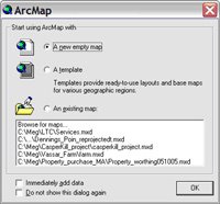
Choose a new empty map and click OK. Click the Add Data button (looks like a Plus sign):

Navigate to C:/ classes/GEOG250/ and open the folder of the city that you are interested in mapping. For example, open Chicago. There is just one file to chose from and is called Chicago_tracts.shp. This is the Census tract data you will use for your map. If the map does not show up in the larger window, you may need to click on the box next to the name of the shapefile in the left hand side of the frame.
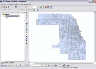
Now that you’ve opened a map layer, save this document. Go to File -> Save and then navigate to the C:/ classes/GEOG250 folder and give the map a name. If you want to work on this map at a later date, either come to this same computer or save the Map Document (*.mxd) file and put it in the same folder on another machine in the GIS lab and your map should open.
As a default, ArcMap give the map a single color. We will want to make a more interesting map by creating a choropleth map.
Mapping Exercise
You will make a map showing at least two demographic variables for one city -- Chicago, New York City, and Los Angeles. You have been provided with enough data to define a city demographically. A great way to show one demographic variable against another is to use a choropleth map of one variable and a dot density map on top of the choropleth map. You can go to the end of this handout and see a list of data available for each of the cities.
One thing that is critical to displaying choropleth maps is that you should not use raw numbers of a particular demographic. For instance, if you want to map the population of Hawaiian and Pacific Islanders, you would make the choropleth map by dividing the total number of Hawaiian’s by the total population. This gives you a rate. Choropleth maps are good for showing rates, medians or averages and dollar amounts.
To make a map of rates, right click on your tract shapefile (left side of window). Go to Properties (at the bottom of the list) and then click on the Symbology tab. Click on Quantities and Graduated colors.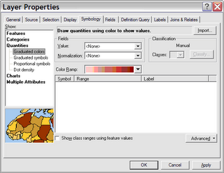

When you click on Values (under the word Fields), you will see all of the data available to you in your table.
Let’s make a map of young people. Way down on the list is a value called AGE_UND18. These are raw or total numbers of people under the age of 18, so in order to display this variable accurately within each tract, we need to normalize the numbers versus the total population in a tract. Under Normalization choose POP2000. You can change the color ramp to whatever you like. But under Classification click on the Classify button and choose the Quantile method. Click OK and you have a map showing the distribution of young people. Notice the numbers are displayed as decimals. If we were to multiply these numbers by 100 we would have a percent.
Now make another map. To do that, click the Add Data button like before and add the same shapefile.

As an example of a chloropleth map that can be made without needing to normalize, we’ll create a map showing per capita income. Go to the Properties window under the Symbology tab. In Quantities choose the value of PERCAPIN. Do not normalize. Choose Quantiles. And click OK. Notice the numbers and remember that these are 1999 dollar amounts of per capita income and the darker the color the higher the dollar amount.
To see the young person map again you can either click the box next to the per capita income map or you can slide one map over the other in the left hand side. Is there any noticeable correlation between these two maps?
Now we’ll make a dot density map. If you are showing raw numbers, like all of the people under the age of 18, you can choose to make a dot density map. A dot density map gives your map a representation of where a larger or smaller number of a variable reside. The dots are not accurately placed.
Add your tracts shapefile again, and this time symbolize under Quantities by using the Dot density method (last on the list). In the field selection, you can choose between all of your variables. The best way to use dot density is with raw numbers, so you would NOT choose median age or per capita income or poverty rate. You would choose something like race, or level of education attainment, or renter/owner status.
Let’s look at people with professional degrees. At the bottom of the Fields list is PROFESNLS. These are all the people 25 and older who have an advanced degree (above a Bachelor's degree).
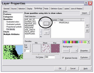
Click on PROFESNLS and click on the > symbol. ArcMap will give the dot a color that you may not like. You can change it by changing the color ramp. Notice the Dot Value given. In the above example one dot signifies 300 individuals with advanced degrees. Click OK and look at your map.
Using just visual inspection, is there a correlation between locations of people with professional degrees and per capita income? How about the locations of young people and people with advanced degrees?
Assignment:
Make a map showing two or more demographic variables of one city and turn it in at the end of this class or the next class session. You should have a choropleth map and a dot density map. Keep in mind that you can show two dot density patterns at one time but take care with your color selection. You cannot display two choropleth maps at once.
Go to Layout View, by going to View -> Layout. This is what your map will look like when printed. You should add a legend (Insert -> Legend). Use the defaults given in the Legend Wizard.
You should add your name (Insert -> Text). The text looks very small and it is placed right in the middle of your map. To move it, click on it and drag it where you want it. To make it bigger, double click on it and change the Properties (character size).
Only after you feel like your map is all it can be should you print. The Layout view is what your printed map will look like, so if it looks odd in Layout view it will look odd when printed. Print to the color printer in the GIS lab and turn this map in at the end of this class session or at your next class meeting.
If you have any questions about this assignment you can contact Meg Stewart or x7708.
CENSUS DATA
Most of the data you will use in this exercise came from ESRI and they got the data from the US Census in 2000. I’ve added a few more data sets from the US Census Bureau’s American Factfinder web page.

You can get all the census data you could ever imagine from this page. But it is not the easiest web site to navigate, so if you want to do a GIS project using some census data, get in touch with Meg Stewart (x7708).
Data Columns in Each Shapefile
| GIS Header | Explanation |
|---|---|
| FID | GIS Use |
| Shape* | GIS Use |
| ObjectID | GIS Use |
| STATE_FIPS | State Numeric Code |
| CNTY_FIPS | Country Numeric Code |
| STCOFIPS | Combined State and County Codes |
| TRACT | Tract Identifier |
| FIPS | State, County and Tract Numeric Code |
| POP2000 | Population 2000 |
| WHITE | White Population |
| BLACK | Black Population |
| AMERI_ES | American Eskimo Population |
| ASIAN | Asian Population |
| HAWN_PI | Hawaiian/Pacific Islander Population |
| OTHER | Other race (than those listed here) Population |
| MULT_RACE | Multi-race Population |
| HISPANIC | Hispanic Population |
| AGE_65_UP | Population Age 65 and Over |
| MED_AGE | Median Age |
| AVE_HH_SZ | Average Household Size |
| OWNER_OCC | Owner-Occupied Housing |
| RENTER_OCC | Renter-Occupied Housing |
| MEDHHINC | Median Household Income (1999$) |
| PERCAPIN | Per Capita Income (1999$) |
| AGE_UND18 | Population Under Age 18 |
| RATE_BPOV | Below Poverty Rate (in percent) |
| NODIPLOMA | Population without a High School Diploma (Age 25 and Over) |
| PROFESNLS | Population with Master’s, Professional or Doctorate Degree (Age 25 and Over) |
| POPOVER25 | Population Over the Age of 25 |
 Once open, pull down the GPS menu to GPS Connection Setup (see screenshot below). Make sure that the Baud rate is set to 4800, that Parity is set to none, that Data bits are 8 and Stop bits are 1. Click the Detect GPS port button. You may get an error message that says the port can't be detected. If this happens, try clicking the Detect button a couple more times. If it still doesn't work, change the Communication Port from COM3 to COM4 or vice versa and try again. Click on the Test Connection button to make sure you have a connection.
 3. Once you are sure that the computer is seeing the GPS receiver, go to the GPS menu again and drop down to Log Setup (see next screen shot). This will create the new file that holds all of the points you're going to be creating.
 Now click the icon that looks like a yellow hockey puck with an arrow pushing down on it (also called "Stamp current position to log"). Congratulations! You've just marked your position on the globe. Let's see where we are.
 5. Now, click the hockey puck icon with the triangle next to it. This launches the continuous logging every second. Start walking and your mapping has begun. You'll note that an arrow has appeared on the screen and that as you walk, its direction changes as you change direction.
 If you want to stop walking, hit the hockey puck symbol with the square next to it to stop logging (called "Stop streaming to log").


