Navigation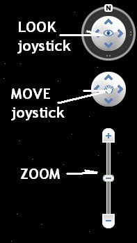
Here are the basics. With Google Earth you can zoom in and zoom out to anywhere on Earth. In the upper right hand corner of Google Earth you’ll see what you see in the picture above. To
Zoom use the vertical slider bar by pressing on the ‘plus’ sign at the top (for zoom in), or the ‘negative’ sign at the bottom to zoom out. Use the
LOOK joystick to look around from a single vantage point, as if you were turning your head. Click an arrow to look in that direction or continue to press down on the mouse button to change your view. If you click on the ‘
N’ in the compass, you can drag North to whichever way you want North to point. Double-click '
N' and the map orientation will place north up. Usually, we want North to be up at the top of the map window, but sometimes (often, really) Google Earth’s North goes astray and you have to make North go up again. And finally, you can use the MOVE joystick as a means to pan around, sort of like a video game. You click on the hand and hold down the mouse clicker and move to where you want to go.
Here's the Navigation page from Google Earth.Or you can just navigate (spin the globe) by panning with the hand tool.
Searching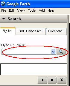
You can zoom to most any location by using the
Search or Fly to area on the left side of the map window. In the text line shown circled in red above, type in either a place name (city, country, geographic feature, for instance) or type in a longitude and latitude, (you can get those from Wikipedia,
for example look at Rio de Janeiro and the Coordinates on the right hand side.) Copy and Paste the latitude and longitude into the
Search line and click search.
Viewing Layers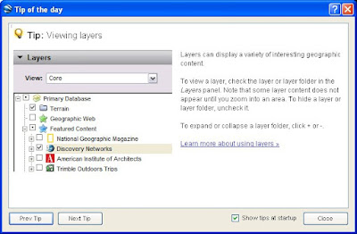
On the lower left hand side of the window you will see
Layers. There are many intriguing layers to click on and off, some of which are really worth exploring. Here’s what to look for:
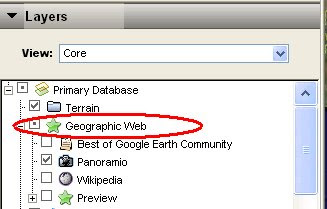
Under
Geographic Web (next one under Terrain), take a look at
Panoramio and
Wikipedia by zooming into an area of interest and checking these boxes. If you do not see
Panoramio and
Wikipedia, click on the plus sign next to the name Geographic Web.
Panoramio refers to the web site that houses millions of geo-located photographs that show up as little blue squares on the map. When you click on them, you get to see what the scene looks like on the ground. These photographs are not taken by Google but by people like you and me - user-generate content.
Wikipedia, which are white square with a 'W' inside, will refer you to a web page with information about a variety of things.
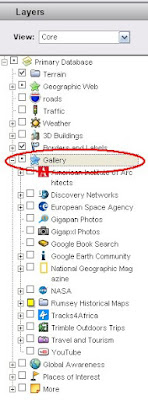
Check out the
Gallery layers (circled in
red above).
Don't click them all on at once! Click on and off the things that interest you and see what you see. One of my favorites is the
David Rumsey Historical Maps site. Double-click on Map Finder and check out London in 1843. Click on the icon that pops up in London, then click on the old map in the balloon.
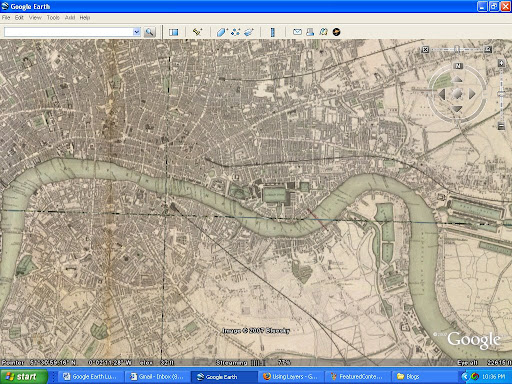
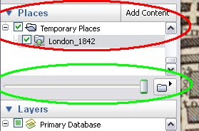
 When you click on the circle next to London 1843 under the Rumsey Historical Maps layer, it can take a few seconds to draw the map. Zoom in to a part of London, highlight by clicking once on London 1843 (you'll find the map in the Places layer, under Temporary Places (circled in red), and then use the slider bar (shown circled in green above) to set the transparency. You can see what London looks like today and what it looked like in 1843. Turn off and on the Panoramio photograph layer to see what has changed, as well.
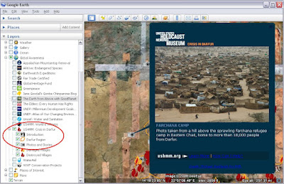
 The last layer that I want to mention is the Global Awareness layer. Rich with data and projects, and one of great interest shows on-the-ground information on Darfur. The layer is called USHMM: Crisis in Darfur.
Measure Tool
The ruler tool (circled in
red above) can be useful for measuring distances. The Google Earth standard version (the free version) allows you to measure a line or a path. If you measure a path, you click along the path that you want to measure. There are a variety of measurement units to choose.
Setting Up Placemarks

You can easily set up a ‘tour’ ahead of class time by using place marks. Find a location that you want to discuss and then click on the thumbtack icon from the toolbar (circled in
red above).
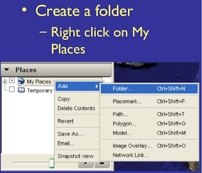
Before you begin setting up Placemarks, create a folder by right clicking on
My Places and then select Add -> Folders. You'll place all of your placemarks in this folder, so give it a name. As a default, a yellow pushpin thumbtack icon will be placed in the middle of your map window. This image below shows a purple arrow. You can change the icon.
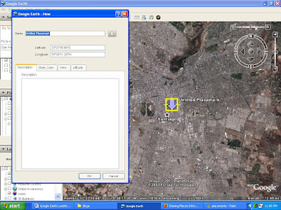
While you are in ‘edit’ mode, there will be a yellow frame around the place mark icon. Type in a title (if you like) for the place mark and type in a description (also optional) and click OK and you then have a place mark saved of the location that you chose. You can always get back to edit mode by right-clicking on the placemark icon and choosing
Properties. The yellow edit frame will show up again.
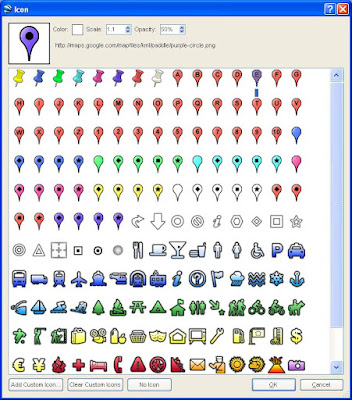
From the
New Placemark window, if you click on the icon button at the top right, you will get a variety of different icons. You can change the size, transparency, color, type, you can add your own custom icon. You can also use on icon which is nice too.
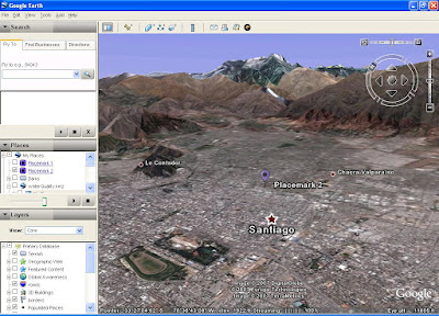
Sometimes the best way to view a place is not like a bird, flying over a flat-lying map and with North as up. If you zoom in a little, tilt the view and rotate the angle, sometimes a place is much more interesting.
When you are done with your placemarks, you can save the folder with your place marks as a KMZ (stands for Keyhole Markup Language Zipped file) file and show it in class on the classroom computer or share it with students through Blackboard or Vspace or email or on the Google Earth BBS. Click on this link to see how saving place marks is done.
Adding a Polygon
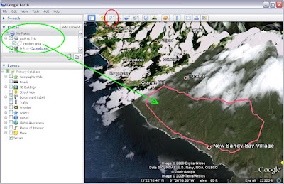
You may wish to create your own map of an area. You can use the
Polygon function (circled in
red) to outline an area that you're interested in sharing. Above I have created a polygon and placed it in a folder called Look at This and called the polygon Problem Area (circled in
green). You can now send this to whomever you wish. Notice that the line follows the shape of the topography.
Adding Your Own Map Sometimes you have a scanned map or some other map that you found on the web or that someone sent you and you want to place it into Google Earth. This is called
creating an Image Overlay. It takes a little practice, but it is a really powerful way to display a simple static map.
To get a real thorough description of how to add an
Image Overlay to Google Earth, you should go to the
Google Earth Image Overlay help section. Here is a very brief explanation of a feature that I think is one of the coolest things about Google Earth.
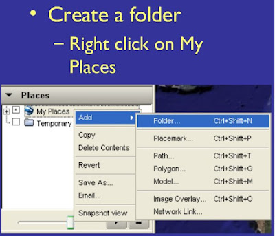
First, create a folder in
My Places and give it a name. Then click on the
Image Overlay icon.
Let’s practice with a map of Israel. If you
Google search ‘Israel’ and then click on Images, (not Maps!) you will get plenty of maps in the first few entries. Take one of those and save it to your desktop. You could also save the URL and use it in your
Image Overlay, but for this example we will ‘pretend’ that this is your own map that you scanned from your own scanner because the steps are exactly the same.
In Google Earth zoom to Israel and orient your window to align at about the same geographic extent as the map of Israel that you have. Click on the
Image Overlay icon in the tool bar (circled in red above).
You will get a new window (like the one you get when you add a Placemark) and you will get some green lines; these indicate where your map will be placed.
Give the map a name, then click on Browse and go to the place on your computer where you saved the map image and add it by clicking OK. The map is now within the green lines.

Use the
Transparency slider bar to make the map slightly transparent; sometimes that makes this process easier. Use the cross hair in the middle of the map (number 1 in the map above) to move the whole map to a new location (your cursor will change from a panning hand tool to a pointing finger tool). Use the diamond on the left side of the map to rotate your map (number 2 above). And use the edge lines and corner lines to stretch the image to the proper orientation (numbers 3 and 4 above). Remember, your original scanned map or map that you got from the web will not change; you can always go back and re-do an
Image Overlay.
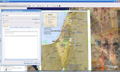
After you’ve moved, rotated and stretched your map to be just the way you like it, you can also add some content in the description area, move the Transparency bar back to Opaque and click OK. Now you have a map to share. Similar to the Tour above, you can share your map with students and colleagues
as a saved KMZ file. Save the folder that contains your map.
Web Resources
Finally, if you want to find out some more information on Google Earth, there are many terrific resources out there for educators created by educators. Sometimes, you do not need to reinvent the wheel when creating a place mark. A good place to start is Vassar’s GIS blog where we’ve compiled many links to Google Earth and other virtual globe materials and information.
 Scroll down this blog page and you can see that there are links to the variety of virtual globes available (at least the ones I’m familiar with) under the Virtual Globes heading.
Right under the Virtual Globes links are the links to Tools for Teaching with Google Earth. Here are some great links. The first one listed include all the KMZs I’ve made for faculty members.
And you should check in with the larger Google Earth BBS and do a search of a place or subject you are interested in. There might be something already out there.
 All the rest of the links are still active, I checked them when I wrote this short tutorial, and I highly recommend them. There are too many great educational Google Earth links to go into detail on each.
If you have any questions, please get in touch with me, Meg Stewart. I’ll help you out.




 Thanks to




 The Aral Sea, of course, is a well-known example of obvious and catastrophic climate change and I showed this to my Earth Science class this summer using Google Earth.


